about project
About Rainbow Movers
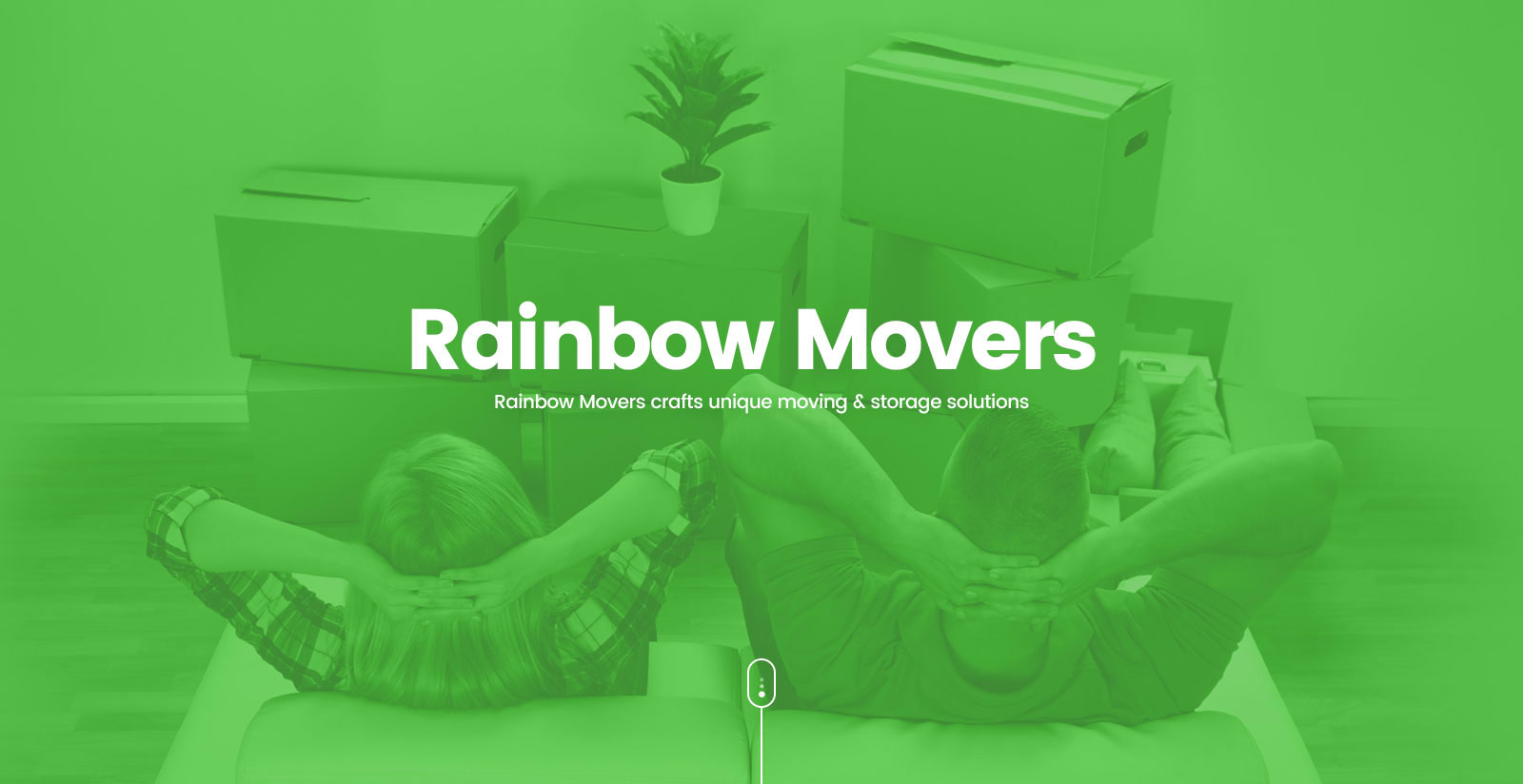
Moving shouldn’t be difficult. Rainbow Movers believe in bringing their customers a stress-free experience with custom-tailored moving & storage solutions. Their online process started with submitting a quote form by the users, having a quick chat with the company and later, leave everything on them. This would make the users life a whole lot simpler.
- My role
- Design Direction
- User Research
- UX/UI Design
- Illustrations & Animations
- Service
- Website Design
- Backend Admin Pages
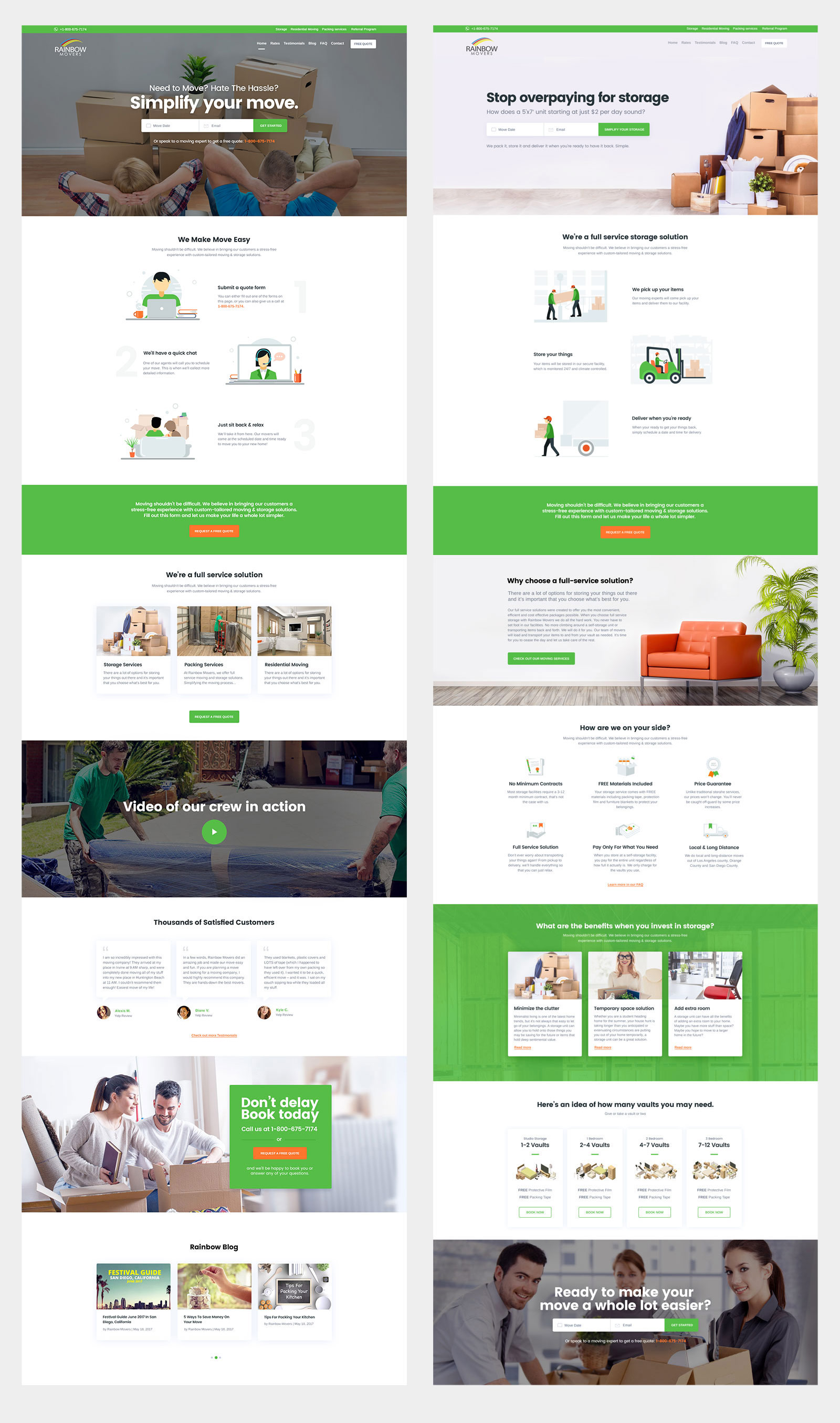
My Role
Rainbow Movers company was looking for best ui/ux designer for their storage and packaging. The Rainbow team approached to me, to do a major UX/UI makeover and to give a friendly and approachable feel to their website. I worked on this project as an Interaction Designer and Developer. I led the team, worked on the sketches and wireframes first, handled all the UI/UX work, mobile application designing, website design and development using wordpress and html and much more. During all this while, I was also responsible for the research in the specified space, visual design, branding, iconography and all print media.
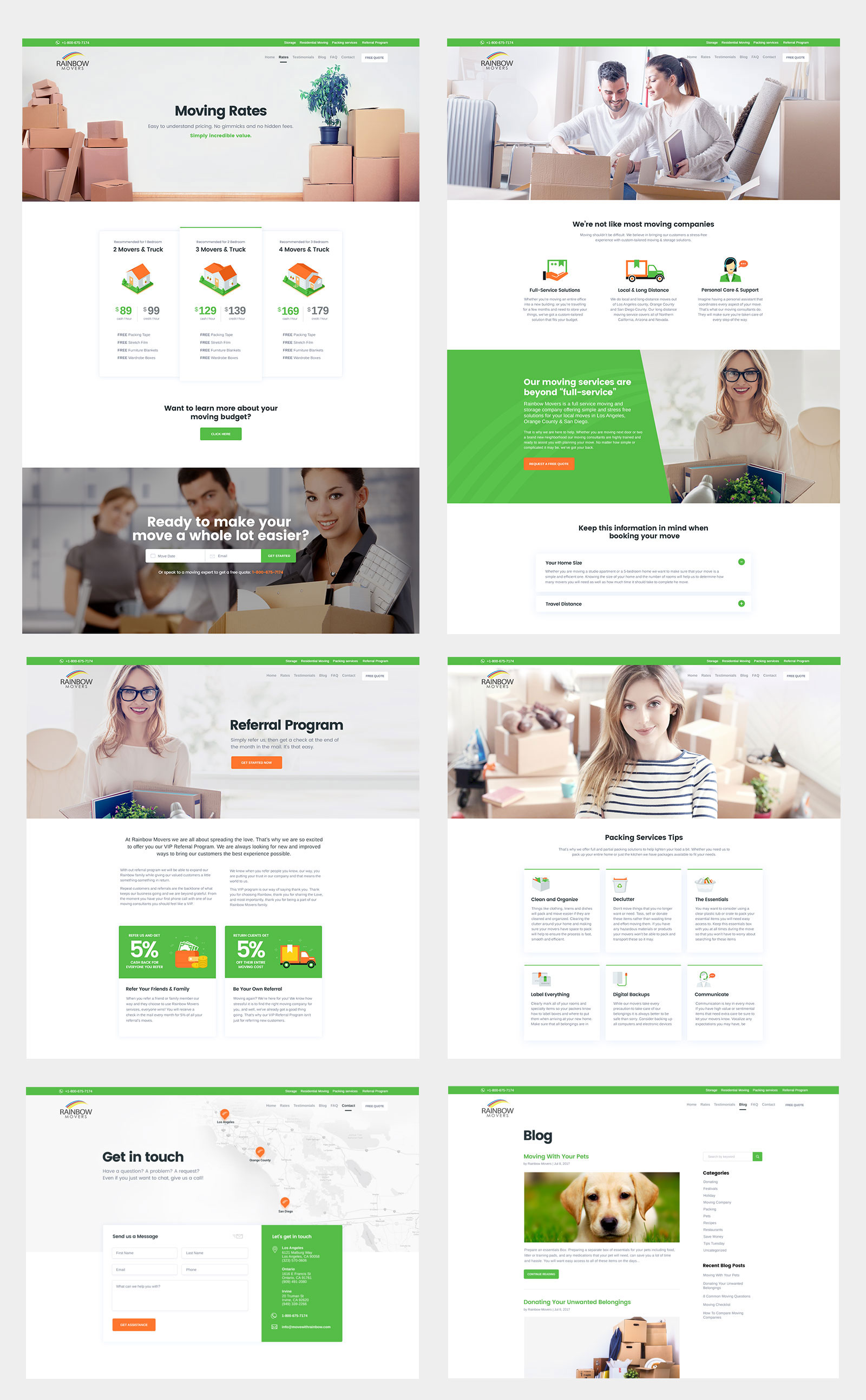
My Approach
I first focused on the user experience of the website. The aim was to create a hassle-free and intuitive experience for the user so that they could get their job done very easily and with minimum number of clicks. I started on with the user experience of the website. After that, I did a lot of brainstorming and wireframing before starting with the visual design. I used Invisionapp, Balsamiq, Photoshop, Illustrator and Sketch, as the major prototyping and designing tools for this project and WordPress, JS Query, Angular js. The company was a full storage and packaging service solution and that message had to be conveyed to the users very effectively through the UI/UX of the website.
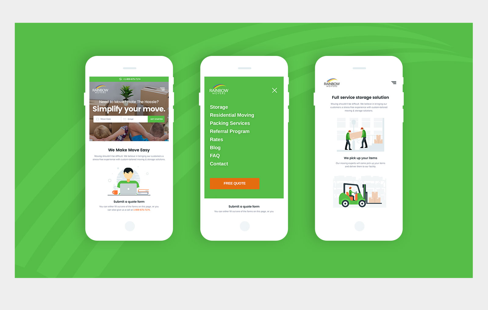
I broke the process into three simple steps. They were- Step 1: Submitting a Quote form on the website which included all the details and requirements of the users, Step 2: Having a quick chat with the company/their representatives, so as to finalize everything, and; Step 3: Sit back and relax! And watch everything being done for them. An enjoyable experience was created for its users through my designs. The final website is a fully responsive, so easily viewable on any device, including small mobile screens to large desktop screens.
Rainbow Movers Mobile Application
The Mobile application was designed with the same visual language. The UI of the application was completely User-centric, responsive and clean. This created an enjoyable and intuitive experience for its users.
