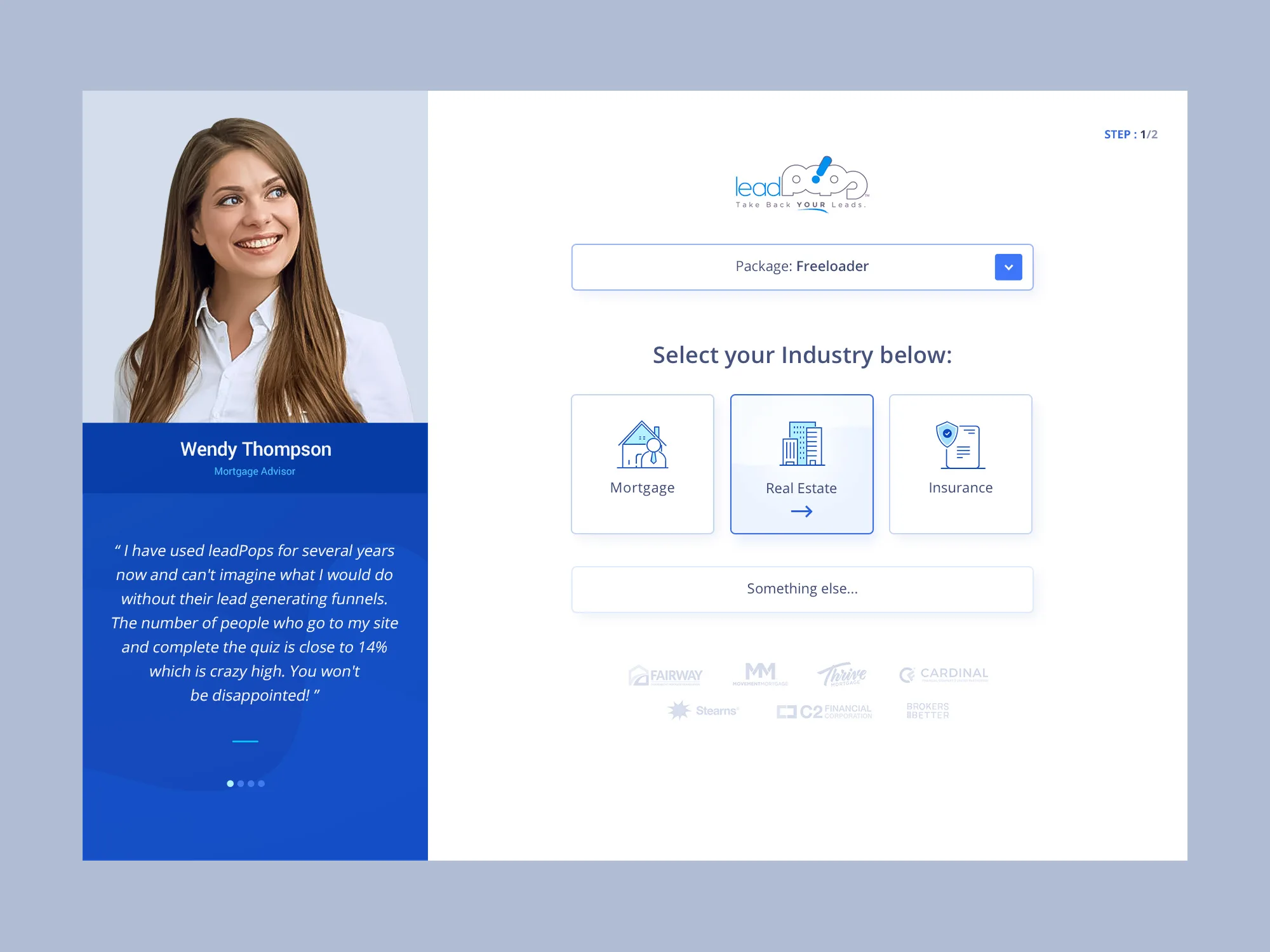
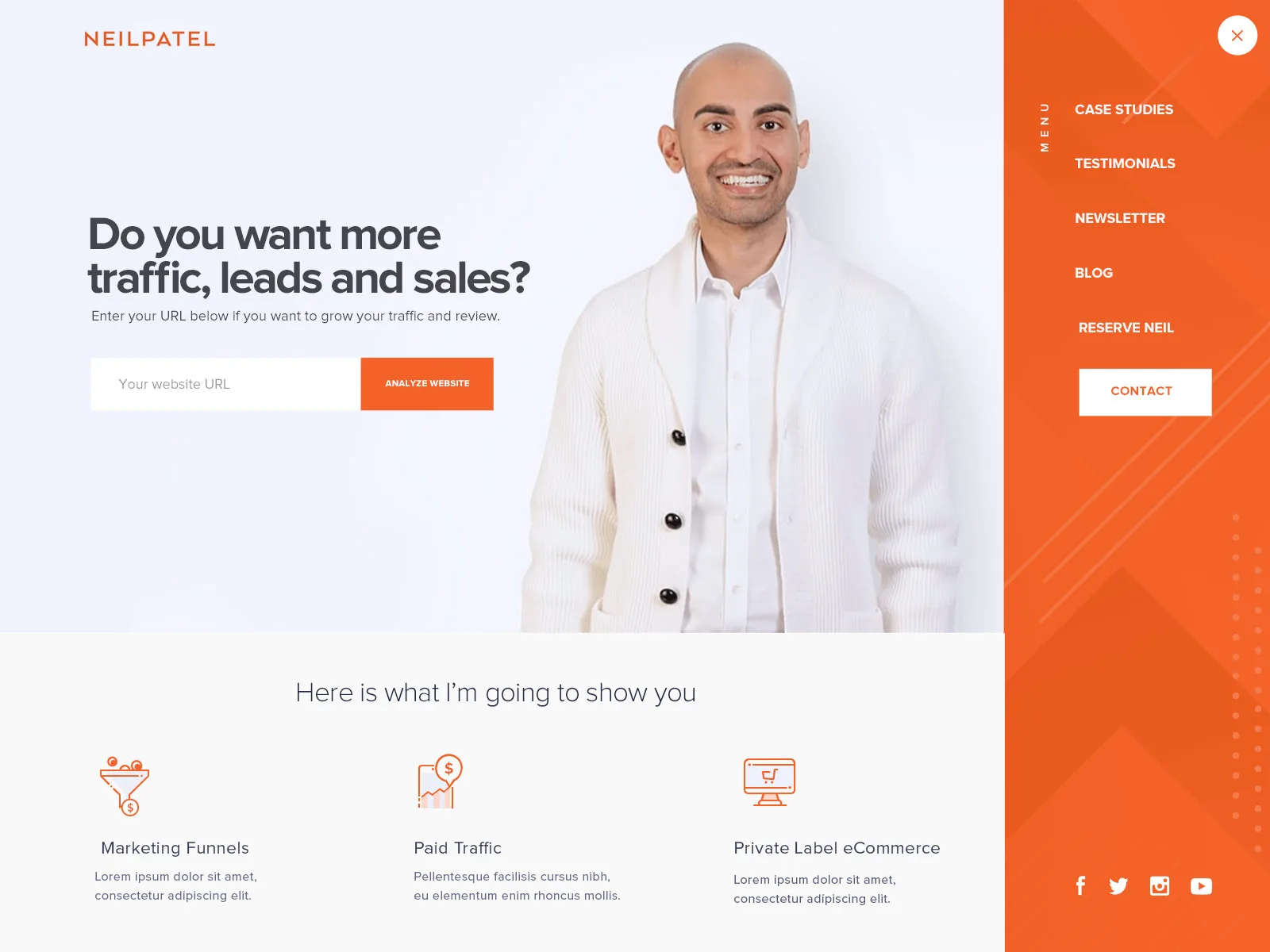
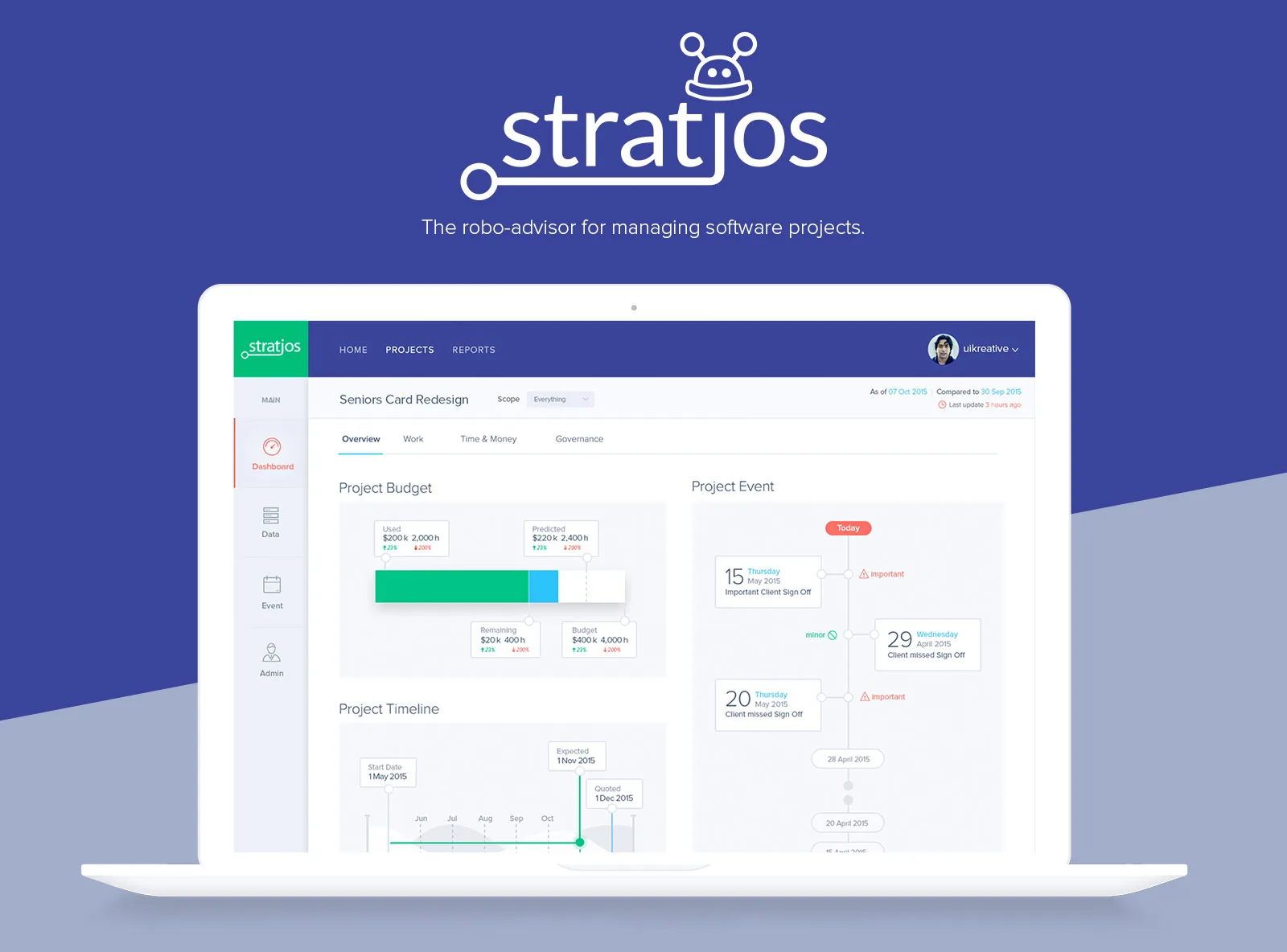
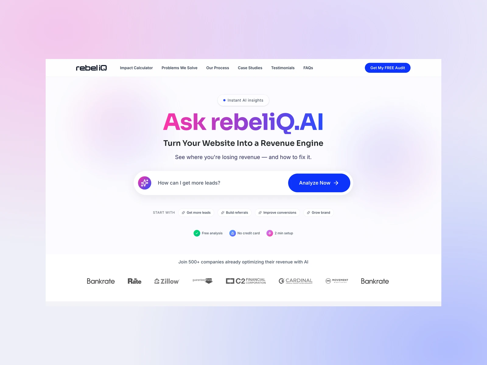
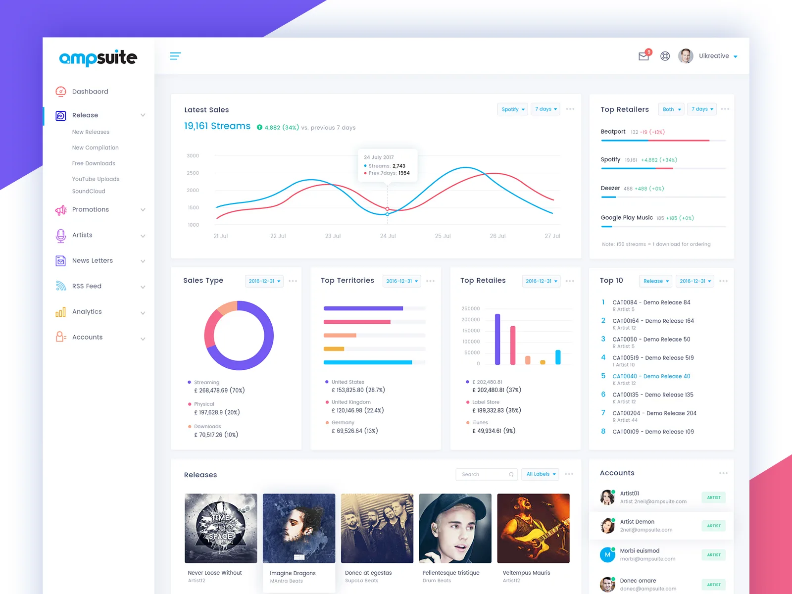
UI design has changed a lot over the years.
I've seen design trends come and go. Some become part of how we build digital products, while others disappear almost as quickly as they arrive.
Every year, there's something new. Different typography styles, unusual layouts, animations, colors, and ways of presenting information.
I enjoy exploring these ideas. Trying something new is part of what makes design interesting.
But I've also learned that following every trend doesn't necessarily make a website better.
For me, the important question is whether a design approach actually improves the experience.
Here are a few directions I think are worth paying attention to.
1. Simpler Interfaces With More Purpose
Minimal design isn't new, but I think the way we approach it has changed.
A few years ago, minimalism often meant removing colors, borders, and visual details until everything looked clean.
Today, I think it's more about removing unnecessary complexity.
A simple interface should still have personality. It should guide users, communicate clearly, and make important actions easy to find.
Sometimes that means using fewer sections. Sometimes it means simplifying navigation or giving content more room.
I don't believe minimal design should feel empty.
It should feel intentional.
2. Typography Is Becoming a Bigger Part of the Experience
I've always enjoyed working with typography.
A strong headline can create more impact than an elaborate illustration or background animation.
Large type, thoughtful spacing, and clear hierarchy can give a website its own identity without adding unnecessary visual elements.
But there's a balance.
Oversized headlines might look impressive on a desktop screen, yet become difficult to read or awkwardly wrapped on smaller devices.
Good typography needs to work everywhere.
For me, typography isn't just about choosing a beautiful font. It's about helping people read, understand, and navigate content comfortably.
If removing an animation makes the website easier to use, that's usually worth considering.
3. Motion That Makes Sense
Animations have become a major part of modern websites.
And when they're done well, they can make an experience feel much more natural.
A subtle transition can help someone understand that a panel has opened.
A smooth page change can maintain context.
A small interaction can make a button feel more responsive.
But I don't think every element needs to move.
Too much animation can make a website distracting, slow, and frustrating to use.
I prefer motion that supports the experience rather than competing with the content.
If removing an animation makes the website easier to use, that's usually worth considering.
4. More Personality, Less Repetition
One thing I've noticed is how similar many websites have become.
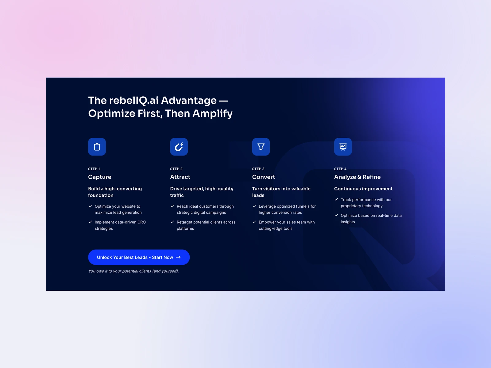
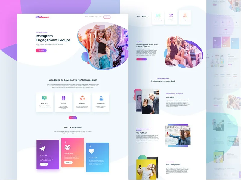
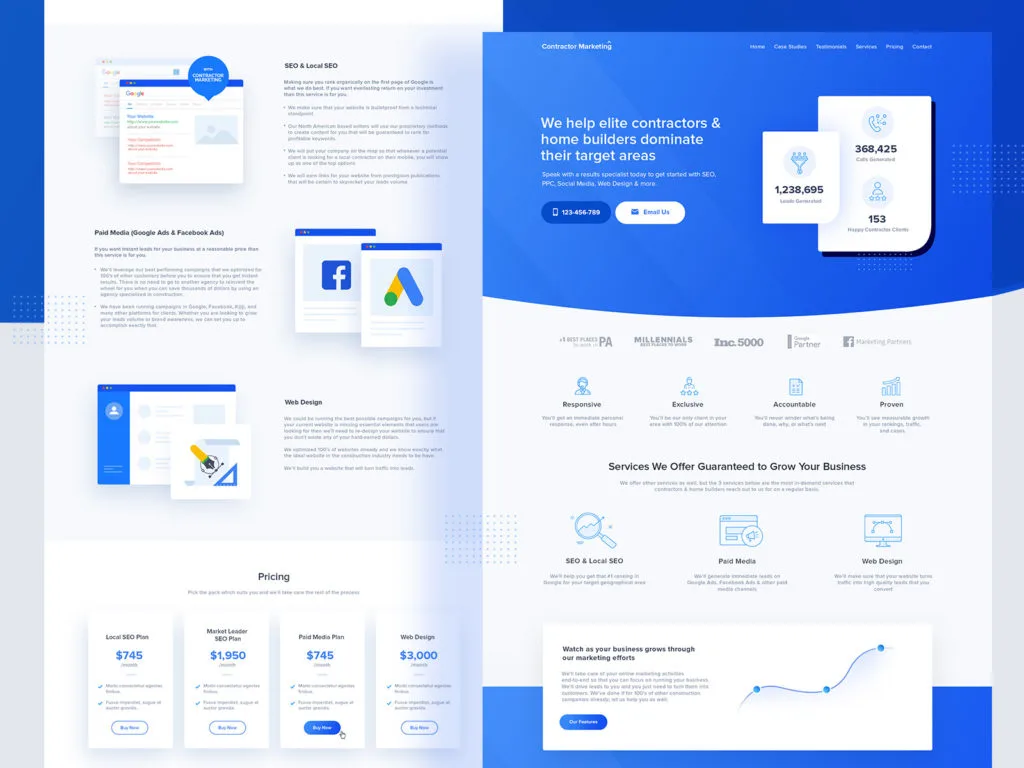
The same hero layouts. The same rounded cards. The same gradients, floating elements, and dashboard previews.
There's nothing wrong with using familiar patterns, but when every website follows the same formula, it's difficult for a brand to stand out.
I think good design should reflect the business behind it.
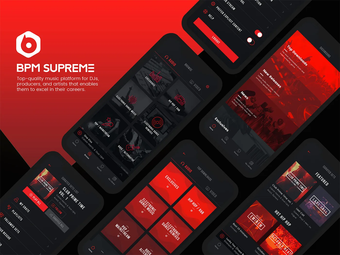
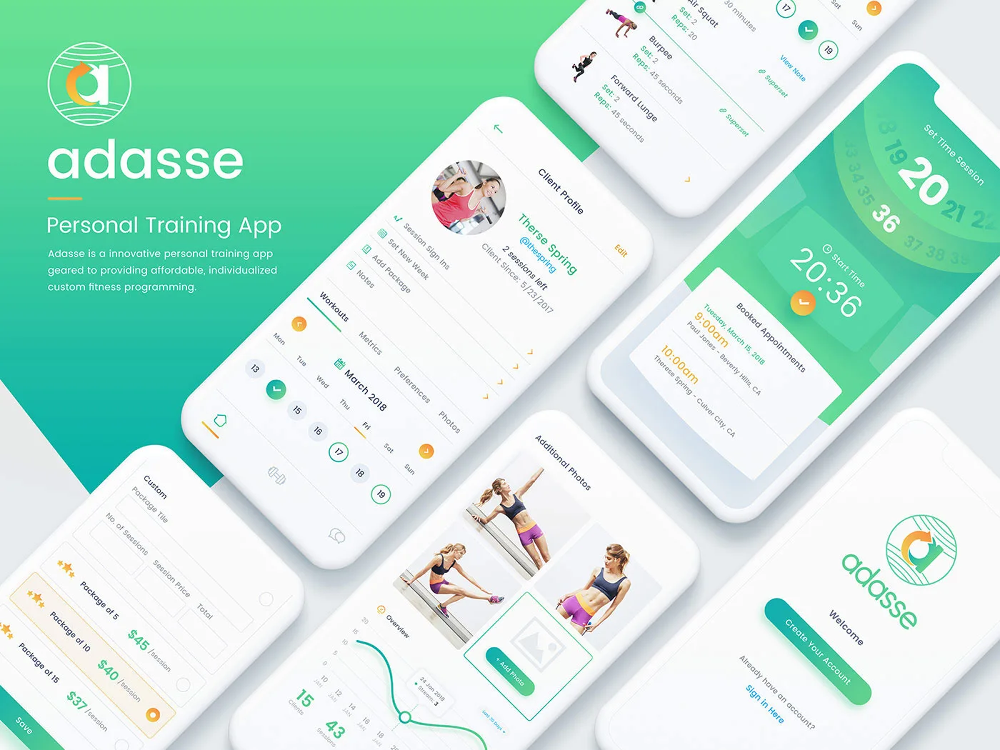
A music platform should feel different from a healthcare application.
A creative portfolio shouldn't look exactly like a corporate software dashboard.
The layout, typography, imagery, and interactions should support the personality of the product.
That's where thoughtful design decisions make a difference.
5. Designing for Real Devices and Real People
Responsive design has been important for years, but I still see websites where mobile feels like an afterthought.
A desktop layout is designed first, and everything is simply squeezed into a smaller screen.
That approach doesn't always work.
People interact differently with mobile devices. Navigation, spacing, buttons, typography, and content hierarchy all need consideration.
Accessibility matters just as much.
Readable text, sufficient contrast, clear focus states, keyboard navigation, and understandable interactions should be part of the design process.
These aren't exciting visual trends, but they're some of the most important details in a good interface.
6. AI Is Changing How We Design Interfaces
AI is influencing both how designers work and how people interact with applications.
We're seeing more products where users can describe what they want instead of navigating through multiple screens and forms.
That opens up interesting possibilities.
Imagine updating website content, organizing information, or completing repetitive tasks through a simple instruction.
But adding an AI chat box doesn't automatically improve a product.
The interface still needs to communicate what's happening, explain the results, and give users control over important actions.
I think the most interesting opportunities are where AI simplifies an existing workflow rather than adding another layer of complexity.
It's an area I enjoy exploring through my AI-powered application development work.
7. Performance Is Part of Good Design
A website can have beautiful typography, impressive animations, and carefully designed interactions.
But if it takes too long to load, much of that effort loses its value.
Performance affects how people experience a product.
Large images, unnecessary animations, heavy scripts, and complicated frontend implementations can make an otherwise attractive website frustrating.
Because I work across both UI/UX design and full-stack development, I try to consider these things together.
A design should not only look good in Figma.
It should work properly when someone opens it in a browser.
That connection between design and development is an important part of my website design and development process.
Trends Come and Go. Good Design Decisions Stay.
I don't think designers should ignore trends.
Exploring new ideas helps us improve, discover different approaches, and challenge familiar patterns.
But I also don't believe every project needs the latest visual effect or interaction.
Sometimes a simple, well-structured website is exactly what a business needs.
Other times, a more experimental approach can create a memorable experience.
The skill is knowing the difference.
After years of working on websites and digital products, that's what I find most interesting about design.
Not simply making something look modern, but understanding what will make it useful.