News — 08.06.2019
Color is always a key component of visual design.
Color is always a key component of visual design. With minimal interfaces, it is even more critical. It is very important to have understanding of how color works at different situations. Since, color forms the environment in which design has to be shown and getting to fundamental theory of color plays a vital role in creativity.
Being my passion it is in our nature now to find out and figuring out pieces of creativity and achieved a natural tendency of identifying patterns and other visual elements appropriate for every situations. It is also important to create patterns in language, layout and design throughout the site to help users feel more comfortable and are able to get things done more quickly. So I keep the interface simple and consistent.
Design is not just what it looks like and feels like.
Design is how it works by Steve Jobs
Design is how it works by Steve Jobs
I may like one color but it may be disliked by other person, reason could be any either cultural background or personal preference. A good visual artist is the one who carries specialization in choosing right color for every mood and can play with saturation of colors to create a standardized design which gave high probability to be liked among the viewers.
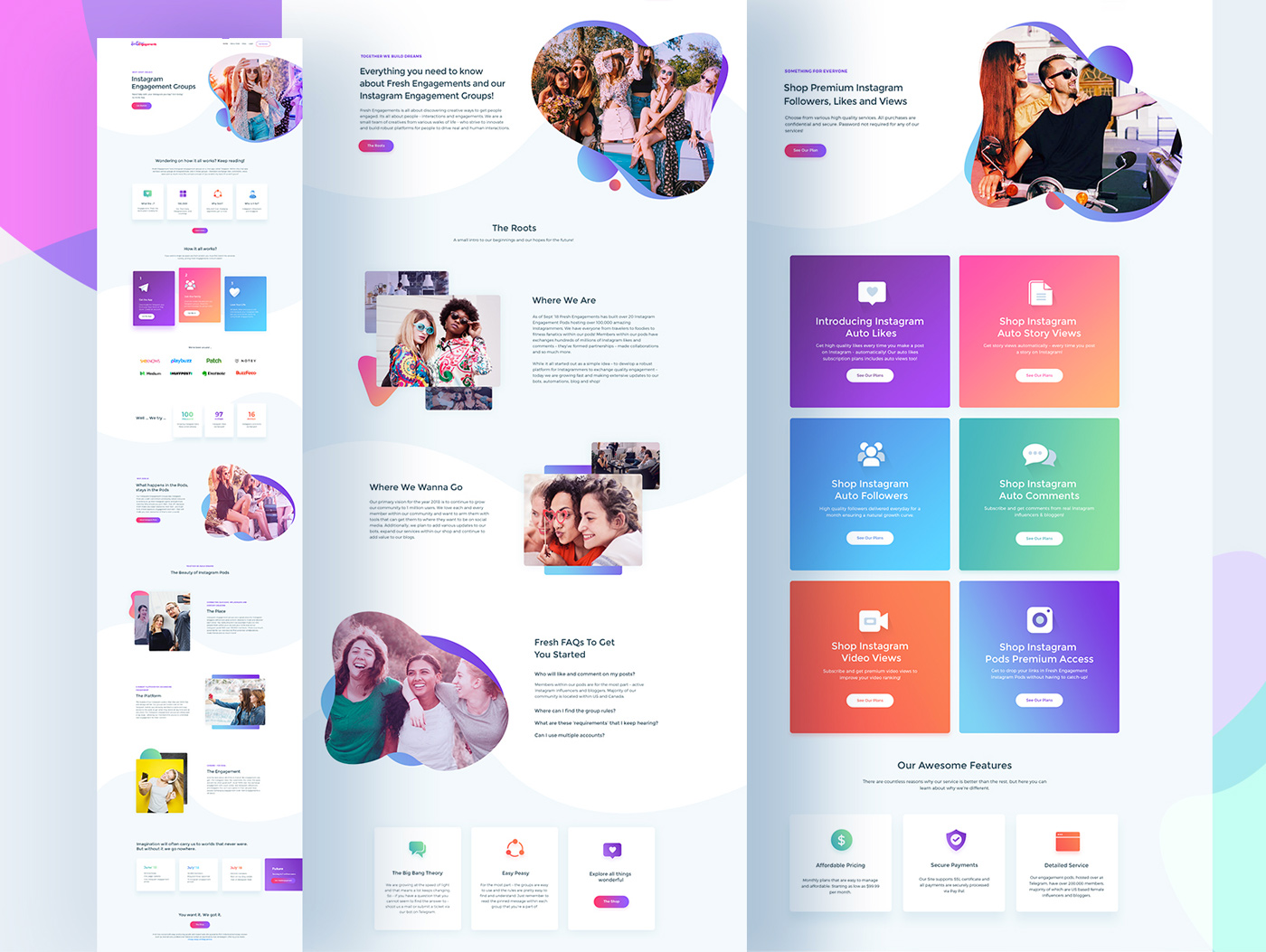
Let’s take a look on my last work and use of colors in application designs:

UI Design:
Although, designer should carry right kind of intelligence to set color combinations, to set the emotions among the viewers, understanding motifs will be a win-win situation in designing terminology.
Let us make you understand how different color impacts on emotional and psychological reactions among the audience.
Just with the understanding of colors motifs, one cannot assure best
delivery of assigned visual design, for that he must create a relation
between motifs and color patterns which when get combined gives an
absolute impression.
Among any color further classification goes like monochromatic,
complimentary colors, Achromatic Colors, Analogous colors, Triadic
colors, double complimentary colors or polychromatic colors, May be
these are pure technical basics but if one understands following
classifications and color spectrum characteristics and can apply the
concepts in designing a visual, it may add a great sense of satisfaction
among the provider and well as the audience.
Related Blogs
The place to share my thoughts and experience about ui/ux design for freelancer.
Thanks for visiting my blog. I am here to receive feedback on my design work and to help my fellow freelance and agency designers. Everyday we are learning more about user interface design, usability, accessibility, interaction, and visual design from some of our work and projects. So let’s share all our knowledge and experience. I love to share my though on any project to any designer.
Jun, 09
User Interface Design Trends You Need To Know About
Color is always a key component of visual design. With minimal interfaces, it is even more critical. It is very important to have understanding of how color works at different situations. Since, color forms the environment in which design has to be shown and getting to fundamental theory of color plays a vital role in…
Read More+Jun, 09
How does UI design transcend beyond websites
In earlier days, User Interfaces has to be effective for websites specially designed for desktop viewing. Now, there is a paradigm shift happening in digital era. At times, since the emergence of BYOD, flat designs for multiples devices and with different platforms are eye catchers for today’s young generation, Interface has to be effective for…
Read More+